
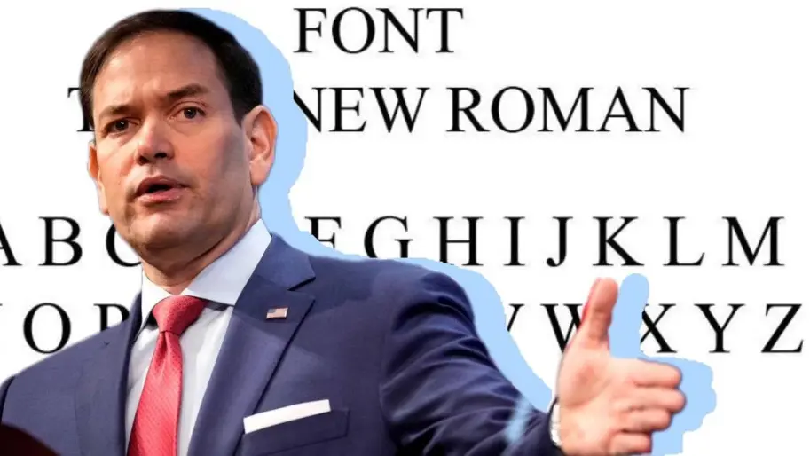

US Secretary of State Marco Rubio has ordered diplomats to revert to using Times New Roman instead of Calibri on all official department documents, reversing a change introduced by the Biden administration. He also reverted the font size from 15 to a smaller 14.
Then-Secretary of State Antony J. Blinken had mandated that the department's documentation switch to the new font in 2023, at the recommendation of the Department of State Office of Diversity and Inclusion, which Rubio later eliminated.
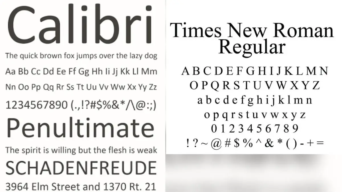 The change was intended to improve accessibility for readers with disabilities - such as low vision or dyslexia - as well as for people who use assistive technology, including screen readers.
Often described as sleek and modern, Calibri is generally considered more accessible to people with reading disabilities due to its simpler shapes and wider letter spacing, which makes it easier to distinguish between letters.
Rubio called the switch to Calibri a failure and "the most illegal, immoral, radical and wasteful."
In a memo titled Action Request, obtained by The New York Times, Rubio said that returning to Times New Roman would "restore decency and professionalism to the department's written work."
"The switch to Calibri has accomplished nothing but degrade the department's official correspondence," Rubio said.
Serif fonts are "generally perceived as denoting tradition, formality and solemnity," Rubio's order said.
Echoing President Trump's call for a classical style in federal architecture, Rubio's order cites the origins of serif fonts in Roman antiquity.
📖 Times New Roman is a serif font designed for newspaper text by the British newspaper The Times (London) in 1931. The actual letter design was created by Victor Lardent of The Times' advertising department. The font was first used in the newspaper's October 3, 1932 issue.
The name "Roman" has nothing to do with the Roman Empire - it refers to the classical style of serif fonts (Roman or Antique fonts).
📖 Calibri is a sans-serif font designed for digital use and optimized for computer screens. It was created by Lucas de Groot for Microsoft around 2002-2004.
The goal was to replace older fonts such as Arial and Times New Roman in Microsoft Office documents, making text easier to read on screens.
The font was first introduced in Microsoft Office 2007 as a standard font for Word, Excel, and PowerPoint. The font features soft rounded corners, optimized letter height (x-height) for improved readability, and a modern, "smooth" look compared to older fonts.
The name "Calibri" has no historical connotations - it is a commercial name created by Microsoft.
Recently, Ukrainian News Agency reported that the Donald Trump administration has proposed an innovation for travelers entering the United States under a visa-free regime: they must report their activity on social networks for the past five years.
Who we are: About us, Contacts. How we write news and our principles: Editorial code. We did our best. If you found this valuable – please support us.
To request a correction, please send an email.